Showing posts with label book cover. Show all posts

Tuesday, April 30, 2013

Z is for... Zoinks! I'm Done!

The very last of the A-Z Challenge posts for 2013. What a journey.

This month took me from concept to completion of a cover for Andrew Leon's upcoming, soon to be mega-hit, Shadow Spinner. A novel he's been releasing in serial format for many months, but will soon see itself all in one novel length edition... hopefully with a cover much like what you'll see below.

In case you don't recall, here is what we saw on day one:

I spent two weeks trying all sorts of different things before I finally came back around to that concept and eventually produced this:


And for those of you that might be interested in what the front cover alone might look like:

Thank you one and all for stopping by throughout the month. Everyone's input has been a huge help!

Monday, April 29, 2013

X is for... Xenia, Ohio

I'm winding down the A to Z challenge. In the end, I may not have a completed cover for Andrew Leon's upcoming novel, Shadow Spinner, but I will have sure as heck tried.

In case you didn't understand, my concept this month was to go from concept to completion of a cover for said novel. It's been a tough month.

This post is for Jo, who hated the white stuff on the tunnel entrance. It's now gone. Replaced with hopefully hard to make out graffiti and whatnot.


And just for an FYI, tomorrow will end with a twofer for me. No, I'm not going to combine letters, I'm going to post twice. Ooh... the anticipation.

Andrew, since I'm getting those done in advance, any changes to the cover that ends the month will have to be done, well, after Z is already posted.

Friday, April 26, 2013

V is for... Very Subtle

We're nearing the end of the A to Z Challenge and I'm a day behind.

In case you're popping in at the very end and have no idea what I'm doing this month - I've been attempting to go from concept to completion of a book cover for Andrew Leon's, Shadow Spinner.

Had very limited time to work on this since the last post. But I still managed to waste most of the time I had in a desperate attempt to save the pallets. I know it's weird that I grew so attached, but I did. So I painted this big rock behind them for them to lean on. I have to admit, it was a damned good looking rock.

What a great rock!
As proud as I was about it, and I even painted graffiti all over it, it just looked pretty bad within the overall picture. So it was taken out (I'm sure a comparison to writing can be made there too).


Without the pallets, which I knew were a problem from the beginning, I think it makes the tunnel look more ominous in a way I wasn't expecting.

On a side note, very observant viewers may notice a subtle change to Tib, nothing major, just taking out a touch of that green, and of course the shadow is now gone. I actually spent about an hour and a half trying to get the shadow to come out of the tunnel and reaching out towards Tib and I couldn't quite make it work.

We'll try again tomorrow.

Tuesday, April 23, 2013

P is for.... Possibilities

I'm way behind in the A-Z challenge. But I hope to catch up this week. Maybe even put up another post or two today. No pressure on anyone dreading the idea of me expecting multiple visits from them per day. I'm just posting my progress.

And what is that progress? If you recall, I'm trying to go from concept to completion for a book cover for Andrew Leon's upcoming novel, Shadow Spinner. I originally planned on spending the first week getting the concept down, and the final three weeks of the month executing the concept. That wasn't to be though, I'm still mired in the concept phase. But I think I've all but decided to go with the tunnel as central theme for the cover, so I went around yesterday evening looking for tunnels.

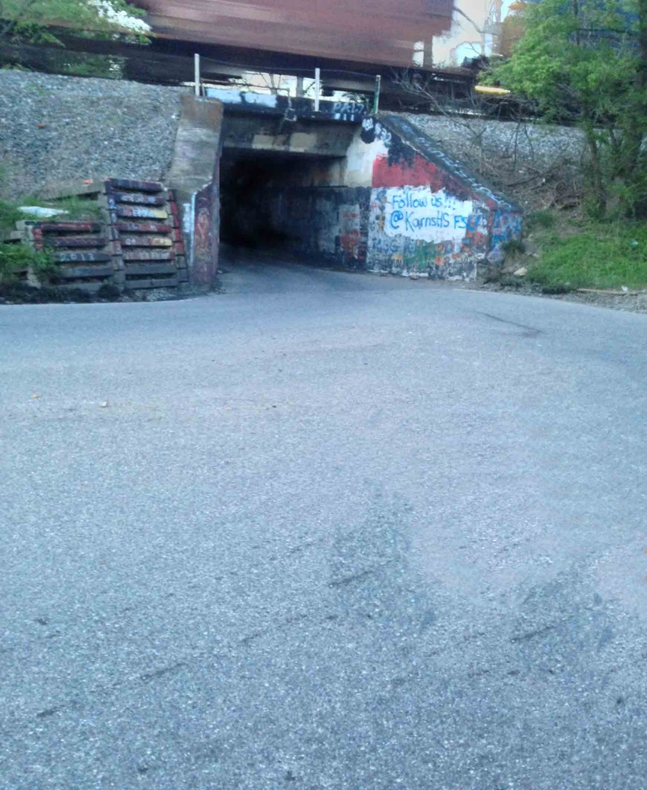
I found this one:

I came home and spent 45 seconds in photoshop to change the most obvious issues.

There, made the tunnel darker (and I suppose, longer) and disappeared the rear view mirror.

It's a start.

Tuesday, April 16, 2013

L is for... Let's Recap!

It's about halfway through the A-Z challenge and I'm a couple of days behind. I'm sure by now everyone knows about what this whole A to Z thing is all about, but just in case - Click to learn more.

For anyone who doesn't already know, I'm trying to go from concept to completion on a cover for Andrew Leon's upcoming novel, Shadow Spinner. Since I'm already so close to the halfway point I should have already settled on a design, but I've not felt super-inspired about anything I've thrown up so far. But then again, it can be hard to use your imagination when the concepts are so rough to start with. But, I hope there is something I've done that Andrew would like me to continue using.

So, I'm posting thumbnails of previous concepts and am asking Andrew (And others too, I suppose) if there is anything here we can take as a something worthy of continuing. I made the last one bigger because I like it more. I've also numbered them for ease of reference.

1
2
3


4

5
6


7
8


9

Wednesday, April 10, 2013

I is for... I like This One Better

A to Z day... um, nine, I think. Read about the woes and why's of other participants in this challenge... HERE.

For those just stopping by, I'm attempting to go from concept to completion of a book cover for Andrew Leon's soon to be released novel, Shadow Spinner. He's giving me hints and 'you're getting warmer' type of clues in the comments each day. I'm still in the concept phase, trying to hammer down something we're both happy with.

So today I riffed on Andrew's comment from the previous day where he mentioned something from early in the book. 

It's still a wee bit rough, but concepts are supposed to be. But I imagine the concept is plain enough.


Monday, April 8, 2013

G is for... Great Caesar's Ghost!

Because I've actually done three sketches for today. I figure I need to get some stuff started if I'm going to get anything done... the month will be halfway over in a few days. So, here is what I have that I've... oh wait, I almost forgot...

It's the A To Z challenge this month. Click to learn about and visit all the others participating. My challenge for the month is to go from concept to completion of Andrew Leon's cover for his novel, Shadow Spinner.

Now, where was I? Oh yes, I was mentioning that I will be throwing up concepts all month if I don't get something I can commit to. So I've done a few concept type sketches - enough to at least get the idea down I wanted to.

The idea here is to put the central characters in a scene that gives on a feel for what the book is about.
This one is just supposed to be creepy and clearly give the viewer the title
And finally, the old 'my shadow is a giant spider' trick. One of my favorites.
A all that blank space to the left is for the back side of the book, so the focus of any of these images would be on the right half of the image... and of course, once we settle in on a concept, I can get to work making it actually look good.


Wednesday, April 3, 2013

C is for... Crappy Software

A to Z day 3! Click here to see the entrants that are participating this year. For those of you that might be just visiting for the day, I'm attempting to do a cover from concept to completion during the month. So far it's not going real well.

I left off yesterday mentioning I'd have a different concept for today. What I didn't plan on is photoshop crashing. In fact, I was so confident that it wouldn't crash that I spent 4 hours working on my concept without bothering to save. Not even once.

I'm sure everyone knows where this is going. All is lost. Everything (From concept #2). But, I did have a sky I'd previously added to yesterday's picture. I liked it quite a bit, even if it looks odd without anything else having any color. Future concepts will have to wait. I'll try again tomorrow.
Sigh. 
Happy Day!

Wednesday, October 17, 2012

A Hero's Journey, A Blogfest, and an Interview

A TON OF STUFF is going on today. It figures. I don't post more than a few times a month and then, bam! Everything happens at once.

I was interviewed over at the A to Z Challenge blog. It was a ton of fun and it should be up today. Please go check it out, it was really cool. .

Today is more of uber awesome Did I Notice Your Book blogfest. Check out my entry at the end of today's post.

And  I've got a guest poster today. My first ever. PT Dilloway is celebrating the release of his new novel, A Hero's Journey, by doing a blog tour. He's here today to talk about the cover. I'm thrilled he asked me to do this. I've been looking forward to this book for a long time.

UNDER THE COVER

First of all, thanks Rusty for having me on your blog today!

We’re all acquainted with the expression not to judge a book by its cover.  Most of us are also probably acquainted with the fact that this advice is hogwash.  Everyone judges a book by its cover!  Think of it this way:  if book covers weren’t important than every book would just have a plain white cover with the title and author name.  So obviously having a good cover is very important.


That’s why I was so glad when I asked Rusty that he agreed to do my cover for me.  For my three self-published books I’d done the covers myself, but that consisted of taking a stock photo (or in the case of my novel Virgin Territory it’s a photo I took myself) and throwing some text on it.  That works fine for literary novels where you don’t really need anything too specialized.  For literary fiction you can generally get away with a picture of some shoes or a sunset or something like that.  If you don’t believe me, go look up literary fiction on Amazon and see for yourself.

The problem with a book like A Hero’s Journey though is that you can’t do that.  You could have a photo of some shoes or a sunset, but it wouldn’t really make sense.  It wouldn’t really convey to the reader that, “Hey this is a superhero book!”  That’s what you really want the cover to do, give the potential reader some idea what the book is before they open it, or in the case of buying online, click on the link.

And as far as stock photos go, there isn’t that much out there that’s helpful.  I mean when you’re creating a specific character like the Scarlet Knight, you can’t really expect a stock photo to look the way you want. The best you can hope for is to find a piece that might fit:  a helmet, a sword, a cape, or maybe boots.  Still, it’s not quite the same as having an original cover.

Unfortunately when it comes to drawing I am completely worthless.  The closest I can come to drawing anything is to make characters on the Sims 2.  Which is why I was happy when Rusty agreed to do the drawing for me.
PT's sketch

The obvious hitch was to decide what exactly to draw.  I finally got an idea, though unfortunately for me it came at about four in the morning.  I got up and spent a couple hours before I had to go to work sketching something very, very crude to give Rusty an idea what I was thinking.

He took that and ran with it big-time.  You can see the finished product.  There was some wrangling with the publisher over the size of the text, which took a few weeks to get to the point where they finally accepted it.

Finished painting
Obviously I’m really happy with how the cover turned out.  It’s a heck of a lot better than some stock photo.  It really gives the prospective reader a good idea of what the story involves.  If you didn’t have a title or description or anything you’d still have a good idea it’s about a woman who’s a superhero in a big city. Maybe you could even figure out her superhero name just from the picture.  I mean she’s got red armor on, right?

I hope you enjoy the cover as much as I do and the rest of the book too.  You can buy the book from theSolstice Publishing website here as well as Amazon, B&N, and other retailers.  To find out more about A Hero’s Journey including character bios, deleted scenes, and a visitor’s guide to Rampart City visit my blog at http://www.ptdilloway.com

Thanks to Rusty for hosting me today and for drawing the book’s awesome cover!

****
I appreciate PT taking the time to discuss the cover, they can be hard work to do. He is also going to be GIVING AWAY ONE FREE PDF COPY of his new novel to one lucky commenter, so let him know you want it down below.

****

FINALLY, DID I NOTICE YOUR BOOK? That's right, in a brilliant game of internet scavenger hunt, Alex J Cavanaugh and Ciara Knight have challenged bloggers to find a book, mention it, and see if the author can find it.

Fun game. So Ben S Dobson, author of Scriber, please come find me. You've got until the end of the day today to win.

The blurb:
 
Disgraced scholar Dennon Lark only wants to be left alone in his self-imposed exile—an exile that ends when a rebel army wielding impossible powers launches a series of brutal attacks on villages across the Kingsland. Forced from his home, Dennon is drawn back into a world he wants nothing to do with. His research into the kingdom's lost past—the very research that sent him into hiding—may hold the answers to a great many questions about the rebels. Questions about their shadowy motives; about their mysterious abilities; and about their ever-increasing numbers, constantly bolstered by those thought killed in their attacks. And only the King's infamous warrior niece Bryndine Errynson and her company of female soldiers trust him enough to help him find the truth before the rebels burn the Kingsland to the ground. Following a trail of historical clues across the kingdom and pursued by forces they don't fully understand, Dennon and Bryndine may be the realm's only hope. But in order to preserve the Kingsland's future, they must first uncover its past.

Saturday, April 21, 2012

S is for Scarlet Knight

It's day S in the A-Z Blogging Challenge.

And today I'm cheating a bit, well, not really cheating, but call it a vacation day from drawing, it was making my wrist sore. So I decided to throw up... eew, gross... throw out something I didn't sketch just for this challenge. It was the digital painting I did for PT Dilloway's upcoming novel with a mystery release date. His A-Z Challenge is all about the backstory to his novel... check it out ... HERE.

So, without further ado: The Scarlet Knight

Hard to believe that is a suit of armor she's wearing... but it is.
If I'd planned better I think I could have made it a much more dynamic image. As it is it's very static, but, you get what you pay for I suppose. In this image I was experimenting with rendering a CG person as my model. She looks okay I suppose.

Friday, January 13, 2012

How The Cola Wars Proved You Can't Trust Anything From Anyone... Ever!


I’m a big fan of Coke Zero. It tastes like Coke, but 0 calories. Yum. Funny that, as Coke already had Diet Coke on the market for a very long time. Same product with all new marketing? Not exactly. I actually think it's an important thing though, so I’ll come back to that in a moment.

Firstly, I’m in “art mode” right now and am struggling to communicate via the written word. I’m still working on another cover that will probably take me through the weekend to get close to being good enough turn over to the respective persons that need to okay it. Then writer Rusty can wake up from hibernation and get back to work. Editor Rusty has no place in my life right now.  So he can die a thousand deaths for all I care.

Like a lot of men, I tend to compartmentalize things, and even though writing and designing/painting are creative endeavors, they seem to come from different areas in my head.  

Because right now, in my head, I’m thinking that I should be drawing a picture of this, not writing about it. Weird.

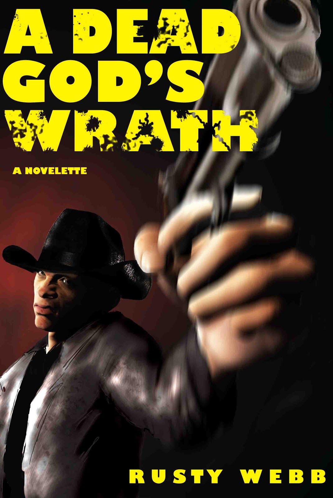
I’ll make mention that as of right now, I’m closing polling on my great cover question from Monday, where I solicited everyone’s opinion on whether or not I should replace my existing cover for A Dead God’s Wrath, which is suffering a bit from lackluster sales. I’m not fretting over it, because the amount of effort I’ve put into marketing that story is about as close to zero as a number can be without actually being zero. However, it did give me an excuse to whip out the old tablet and paint some. But I went all over that in Monday’s post.

The results:

I had 22 people respond to my question: Which cover should I use?

People who thought they were both so awesome that they would rather choose between their children than those two book covers (i.e., worried they’d offend me by choosing): 5

People who preferred the original cover: 16

People who preferred the new cover: 1

You know, back in the early eighties Coca-Cola had been tinkering with a new formula for their flagship drink. But it had been around - more or less unchanged - for decades and they were nervous about making changes to a much beloved product willy-nilly. These folks were no dummies, so they decided to do some research first.

Actually, that’s a bit of an understatement, they carried out the most extensive marketing research program in the history of the world to determine how the larger public would react to their new flavor for their drink. After it was all said and done they had an overwhelming response from the public. The new formula rocked, the old one was history.
It must be better. It's new!

So, they unveiled what is universally considered one of the largest disasters in the history of product rollouts. They labeled their product as ‘New Coke’ and quit selling the old stuff altogether. Pepsi celebrated by lighting Michael Jackson on fire, symbolic of the king of soda going up in flames (Don’t bother looking that up, that’s what happened, trust me).  Coke had a huge, and I mean huge, PR mess of their own making on their hands*. Well, actually, it was the fault of the people of America, who LOVED this New Coke more than anything ever made, until it actually hit the market, when they universally decided that they hated it.

The point? They lied. Not Coca-Cola, but the people who said they liked New Coke in the first place.

Not on purpose I’m sure, but the end result was the same. When you want to know what people want, ask them, then do the opposite of what they say. It works for product rollouts, it works for presidential candidates, and it works for book covers.

By my math, it’s 16-1 in favor of changing the book cover. Thanks everyone.**  

*Not entirely true, all those years of research that went into the formula for New Coke actually came from their introduction of Diet Coke. Which of course is why New Coke tasted like crap. It was just Diet Coke with sugar instead of aspartame as a sweetener. Coke Zero actually uses the formula for Coke (with artificial sweeteners instead of sugar, Diet coke still plugs away with the ‘New Coke’ formula)

** I’m kidding. I still might make the change, but it won’t be because I think everyone is lying. I’m not creating soft drinks here.

Wednesday, January 11, 2012

Book Cover Week Continues!

I'm sure no one is entirely thrilled with this post, but since Grumpy Bulldog, Secret Agent, has publicly been soliciting advice about his book covers for his upcoming novel releases. I thought I would answer my own question that I asked during one of my comments at his site a few days ago... found here

I mentioned that he might want to consider doing minimalist covers instead of the characters in environments covers he has mocked up. This way, the bottom half of each book stays the same with each installment, except for the title changing. And the upper portion has a variation of the helmet each time. Brilliant!


Just a mock-up, I don't have rights to the helmet I lifted from the internet. And I'm sure Grumpy would point out that purple isn't the same as scarlet... I'm just throwing my idea out there.


Monday, January 9, 2012

The Juggler

Yep, that's me. I managed to get a lot done this weekend around the house, and I do mean a lot. Still, not as much as I wanted to otherwise. I decided I'm not writing another damn word of fiction until I get some art related projects done for some other folks. Weeknights tend to go poorly for me in that regard, but I'm going to give it a shot this week.

I did sit down this weekend and play some more with that 3D software I got a few months ago. That has a ridiculous learning curve, I clearly have no idea what I'm doing. However, I did do something book cover wise - er, for myself.

This is the version I've had around since August
My novelette, A Dead God's Wrath, was released last August and I've never been too thrilled with the cover I did for it. I had in mind do do several installments in the same universe, and wanted the covers to all be riffs on a theme. I haven't come up with a theme, per se, but I did think the cover didn't do me any favors. I mean, it isn't bad, it just doesn't make me shout from the rooftops.

So, I have decided that I need a new cover for myself. I do realize that a lot of other folks are waiting on me to do stuff for them, and I am on a short timeline, but this is sort of an exercise, getting out of writing mode and into artsy mode.

So, I came up with the image below and am thinking of putting it up as a replacement for the existing cover on the novelette.

I wouldn't get mad if I got some advice.

A super special edition collector's cover maybe?
The man on the cover is the 3D model I made. I think he's passable enough as real except for the way his arm bends as he holds the gun, that gives away the illusion some. If I work on it enough I'll get better. I actually blended the model with regular digital painting stuff. Doing that is a cheat, because rendering hats and clothes take time and skill that I don't have. So yes, I rendered a naked man, and painted clothes on him.

But, I think I can see the potential in doing stuff with the 3D software. Once rendered, they can look pretty cool.

Anyway, should I make the change? Or keep working on it? I am a bit worried that no one would have a clue about the Science fiction elements of the story based on this cover. It might give the wrong impression.


Friday, January 6, 2012

Cerulean Isle

I did a book cover recently for the fine folks over at Wido publishing. They were very kind and forgiving of my consistent unprofessionalism. The cover they let me do was for Cerulean Isle, by G.M. Browning.

I asked for ideas they wanted me to try out and they just told me to have fun with it. I submitted a version of the above picture and they liked the concept and we went from there.

Funny thing about the concept though, as it required a great deal more work than I anticipated to bring it to fruition as a final product. During the process I kept wanting to tell the great people over at Wido that it was good enough. But I am an author too, and I would be really disappointed if my cover artist half-assed a cover for a novel that I may have spent years perfecting. So I kept go back over it until all of us were happy.

Funnily enough, I spent most of my time reworking the back cover of the book. My first version had the owner of that fin pictured coming out of the water. I had been trying to portray a scene from the novel, but had gotten enough details wrong that the idea had to be scrapped altogether. Still, check out an early version of the wrap around cover:
Notice how dolphin-like the tail was at first... because I used a dolphin as a model

Yes, my son was serving as my merlord model, I've been using him as a model for all sorts of my art projects for his entire life, so it was no big deal to him. But in the end, he was scrapped for the open ocean.

By the end, I felt pretty good about how things went. The final version, had several other changes to it before it was sent to the printer, although I had nothing to do with the back cover text or spine design:


Anyhow, the process took a bit longer than I wanted it too, but I love how it turned out. I also have a host of other covers I'm working on this month. 

Happy days everyone.


Tuesday, August 30, 2011

Again with the Book Covers

Yesterday, I talked a bit about book covers and specifically about part of the process that went into making the cover for Andrew Leon's new book, The House on the Corner: First Person Edition

Today I wanted to talk a bit about my own cover, the novelette I released a couple of weeks ago had another cover that I painted, I was particularly proud of the final image I used for a pretty stupid reason. I didn't bother with using anyone for reference when I painted the guy. I just thought he ended up looking pretty good. At the last minute I decided it was much more dramatic to put him (mostly) in silhouette, striking his dramatic pose.

But then, maybe a week after I had the book out I noticed something, something odd. I'd created a bit of an optical illusion. You know, like the thing with the single vase or two people thing

I don't even know what I am
Optical illusions are funny things, sometimes once you see an image one way you can't unsee it. It's there forever. I'm sure there are reams of data that describes what seeing optical illusions have to tell us about how our brain works, in fact, I've read a ream or two myself on the topic. Very interesting.

If anyone hasn't been aware of these wonders, please spend a few minutes on google, you'll be amazed at some very amazing illusions.

Mine on the other hand, isn't amazing, just annoying. Sigh. Sometimes I just can't win. This illusion I created is bad because although subtle, to me, if you see it the way I didn't intend, the image becomes much less dramatic, much less powerful, and much less of what  I wanted. So I want to ask everyone a simple question.

In the cover below - where is our cowboy looking?

I'll give you a hint, if you don't think this is awesome, you're looking at it wrong.


Monday, August 29, 2011

Optical illusions and Book Covers

Hey all, over the weekend, the worst kept secret on the internet was made public, Andrew Leon announced the release of The House on the Corner: First Person Edition.

And it was great for me because several months ago when I asked if anyone needed some help with covers for their books to let me know, he was the first to ask.

I know I've talked about covers some in the past, and I don't really want to go all goofy talking about them again. The goal of any cover is to make someone pick up your book (or click on it) after they get that first glance.

That's it. Sometimes an ass ugly cover is perfect if it makes you pick it up and look at the book. I've been known to take pictures of books when I fall in love with the cover (I could look them up online, but it's easier for me to just snap a pic with my phone - then I don't have to do anything else later to try to remember).


So, when Andrew gave me a synopsis of this book, and the first few chapters, I thought of the perfect book cover - but I thought  there might be some legal issues if I sent him the movie poster for Monster House with existing title scratched out and his written over the top. So,I had no intention of copying the movie poster. But I did think it felt right for the book he was writing. So I emailed him and asked if that  was the 'vibe' he was looking for.

A quick yes and I was off to brainstorm. I initially thought I would do the cover using a photo of an existing house - so I ran out one morning just as the sun was coming up and took a few photos and fired this off to Andrew, asking what he thought of something like this:
Clicking makes it bigger

Now, I was surprised at how easily the concept seemed to come. In fact, at the time I did that I was thinking this whole cover art thing was such a breeze that I might be able to crank out 3 or 4 a day. I told him I would find a house that fit the descriptions inside the book a bit more closely and we'd go from there.

And that's where the problems started, I had some difficulty finding the right house. I was unhappy with them, all of them. I had issues with finding the right place to stand to take the photos, with the lighting, and once, when I was more than a mile from my car, walking through neighborhoods and looking for the perfect photo I got caught in an unexpected rainstorm that came down with more ferocity than any I'd seen in recent memory. It was a very long walk back to my car after that.

This went on for some time, I spent hours and hours looking for just that right house and I couldn't do it. I had nothing. So I made a reluctant decision.

I would paint it.

I thought of that from the very beginning, but rejected the idea right off the bat as too time consuming. But at this point I had already spent many hours with nothing to show for it. Andrew had mentioned before that the house was based off the real home that belonged to his Grandparents when he was young so I asked him if he had a photo. He sent me the Google street view and it was there. That was the house.

So, using that picture as a reference, I was able to paint (digitally, btw) what eventually became the final cover.


There is still a thousand little tales here, decisions made, or rejected, about fonts, sizes, clouds, trees, colors. Each one was agonized over, all in the hope that somewhere, somebody will see the above, shrunk down to the size of a postage stamp, and click on it.

Saturday, June 25, 2011

On Covers

Covers. It's the thing that makes people take a second look at your book. I've seen some great ones, and some pretty bad ones. With the rise in ebooks I'm told that a lot of the intricate paintings that used to grace book jackets are going away in favor of a minimalist image. One striking feature and some big text.

It makes me sad, I know LP's used to be a great canvas for art, and CD's did a lot of damage to that - then the iPod sized covers forced more changes to how covers were done. I suppose it was inevitable that it would happen to books too.

But, while day I work for the man, by night, I write crappy fiction that no one ever sees, and now, by nightier night I guess I'm an amateur graphic artist. I wanna do book covers.

So, anyone need one?

Here are some I've done in the past, both real and fake *edit* I mean, real and fake books, in case that was ambigous:

Fake: But based on a story I wrote
Real: But not for sale
Real: For sale, but no one will buy it
No promises of greatness, and I can't do anything you dream up. But I'd like to give it a shot, practice for myself should I take that plunge and self pub something in the future.

Aloha

Wednesday, February 16, 2011

And While We Wait

My wife is finally reading my novel in earnest. I am sitting right beside her trying to look over her shoulder as she reads. Gee whiz it makes me nervous.

But I had this brilliant idea for a cover for my book... I know. I'm stupid. But still, in my head it's awesome. I sketched out my astronaut  guy that I was going to use...

Look ma! I have dis-proportionally large hands!

Aside from the fact that I was a much better artist when I was in fifth grade than I am now, this was still only intended to be a quick sketch. What this doesn't do is capture the feeling I wanted it too. So this most definitely won't get used in any mock-up of a book cover that I'll ever use.

I like my idea though, I'll sketch something better soon. Take a little more time to get the body language right (he looks like he's sneaking up on someone - not what I was going for) and then work on making it look good.

Still, I'll be keeping my fingers crossed for a good review from the missus.

Friday, December 17, 2010

Procrastination: Thy Name is Rusty

It's true. It doesn't matter how important it is. If I have something to do, no matter how important or urgent, I will put it off.

Why do I do that? I don't know. If I intend to clean, I'll have to piddle on the internet first. If I want to write, I'll have to read just one more chapter before I do. If I want to read, then I'll have to watch a few minutes of TV first. If I have to be go to work, I'll just have to take a picture of the sunrise.

Sigh. It goes on and on. If I set out to take a picture, I'll decide I need to draw a picture to get in the right frame of mind. It's a rare gift, or at least it is on the level I demonstrate it, but man does it have a tendency to throw my life into havoc at times. That's the real reason I struggle with Nanowrimo every year. And it confounds my wife to no end trying to figure out how I can carve out a block of time to write for several hours and come away with 19 words written but a killer guitar riff to show off.

So what has been my diversion today? Well, I set out to write some this evening on one of my always in various stages of editing novels and I starting thinking of titles. My working title was something stupid of course, like, The Dead Man Who Lives... To Die!, or maybe, Ricky's Rockin Rampage of Reclusive Reflexology.  In other words, aside for my love of alliteration - I've got nothing.

So I was thinking on the topic of titles, knowing full well if a miracle occurred and a publisher just waltzed up to my front door and said they'd publish me that they would really not care about what my title was... and even less so about my cover.

But I also harbor a secret desire to be graphic designer. So book covers are totally something I'd dig creating. It seems like folks have homemade covers before they write a single word of prose. Well, to avoid writing this evening I decided to work on a cover of my own. My title still sucks something awful, and I can't really think of how it even applies to what my story is about. Regardless - here it is:


So there it is. My attempt at another book cover. I really have a fancy to try a space opera or something hand drawn but something like that would take some time and effort to produce. To make one actually look good would require skills I just don't possess.

But I still think it's fun.